 | Tumblr staff has made some dumb decisions in the past. This one though, has to be the worst so far..." -Bayleaf Wilson |
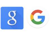
Google, why did you have to change? According to them, the logo change was made to make things easier to see to even on the smallest electronic device. It was created so the logo could be seen equally across all platforms.
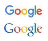
Now, Google had help making this new logo with the help of Alphabet. Alphabet, being a collection of big time companies, owned by or tied to Google. Alphabet is stating here that their main goal is to keep changing and adapting in order to revolutionary. Google says here that with this new logo and new font, accessing their site will then be much easier and more open across platforms. How that is correct is clueless to all but Google staff unfortunately. It seems that the general consensus for the new update is “why, no, and stop.” Another aspect that upsets a lot of users is the new trend of sans serif font.
Now, Google had help making this new logo with the help of Alphabet. Alphabet, being a collection of big time companies, owned by or tied to Google. Alphabet is stating here that their main goal is to keep changing and adapting in order to revolutionary. Google says here that with this new logo and new font, accessing their site will then be much easier and more open across platforms. How that is correct is clueless to all but Google staff unfortunately. It seems that the general consensus for the new update is “why, no, and stop.” Another aspect that upsets a lot of users is the new trend of sans serif font.
“So the new google logo uses a sans-serif font.......I guess it could always be worse. pic.twitter.com/W5b0TKo3wQ”
— Kyle (@foreverakyle) September 1, 2015
One could argue that the font gives it a “simple, friendly, and approachable” look, as is described by Google. Yet, so many people think it just looks childish and cheap. It’s not only Google that’s doing this though.
Tumblr staff has made some dumb decisions in the past. This one though, has to be the worst so far. This new update is so bad that there has been a boycott and a petition to change it back. While there might be a total of two people who actually like the new format, so many people hate it and have no problem expressing that. A blog called consult the muses actually did a poll to get users views on the new Tumblr updates and the ones in the past. When asked if they liked ANY of Tumblr’s new updates 4683 users said no, while 393 answered yes.
When most people express this with Tumblr staff, they get ignored or even shut down. It’s so bad right now that Tumblr has three stars on the Apple Store. Hopefully with enough time, boycotts, and petitions, Tumblr staff will realize how serious it’s users are and change the format back.
Now one could wonder, why is this a big deal? Most say it’s because we grow up with most logos and see them on a daily bases; then they change into new logos, frustrating us. For those who grow strong connections to an app, it’s particularly upsetting. One could grow up seeing the same old Google logo, or get so used to seeing the simple but messy stacking of text in Tumblr; then be completely thrown into a change. Users get used to a website and most hate to see it change.
All in all it depends on who you are; but for the majority, you will always hate an online update.